

Visualizing Excellence: The Olympic Games Data Project
This project analyzed the Olympic Games dataset, focusing on two key aspects:
- The evolution of the games, with a detailed review of team vs. individual sports and gold medal trends by country.
- Torri Huske’s journey to gold, using time-based visualizations to tell the story of her performances in individual and team events.
The goal was to transform raw data into an engaging, accessible experience, allowing users to explore the intricacies of Olympic competition and celebrate the athletes’ achievements.
Duration
5 Weeks
Deliverables
High Fidelity Website
Tools
Visual Studio Code, Figma, HTML, CSS, JavaScript, Illustrator, Photoshop
Research
To begin, I created detailed spreadsheets categorizing all gold medal data from the 2024 Olympics:
- Organized by team sports and individual sports, highlighting national strengths in each category.
- Given the larger volume of individual sports data, I normalized values to ensure a balanced comparison across countries.
The result was a comprehensive dataset that provided the foundation for meaningful insights into performance trends.


Initial Design
I envisioned a single web page featuring:
- Four interactive bar graphs: Allowing users to navigate between team sports, individual sports, and overall medal counts.
- Buttons for dataset navigation: Ensuring smooth exploration of the data.
- An analysis section at the bottom of the page, presenting key takeaways and patterns observed in the data.
Research Part 2
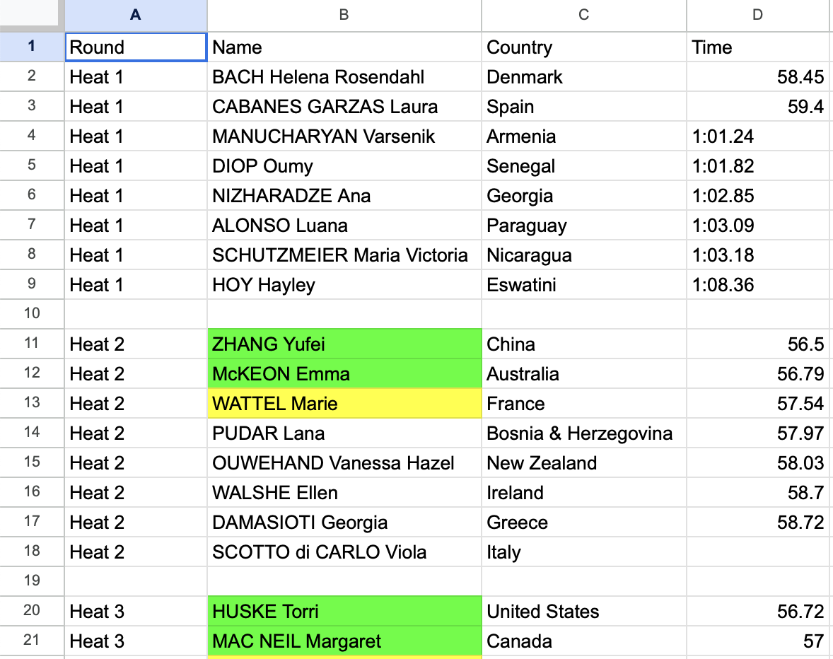
I developed two spreadsheets focused on Huske’s standout events:
- 100m Butterfly Race: Tracking every stage of her individual competition, from heats to the finals.
- Mixed 400m Medley Race: Mapping her team’s path to success, organized by heats, semifinals, and finals.
These datasets allowed for a detailed breakdown of her journey, contextualizing her achievements with timing, dates, and venue connections.

Design Evolution
To better organize the content, I divided the original single-page design into three distinct pages:
- Home Page: A welcoming introduction with an overview of the two main sections.
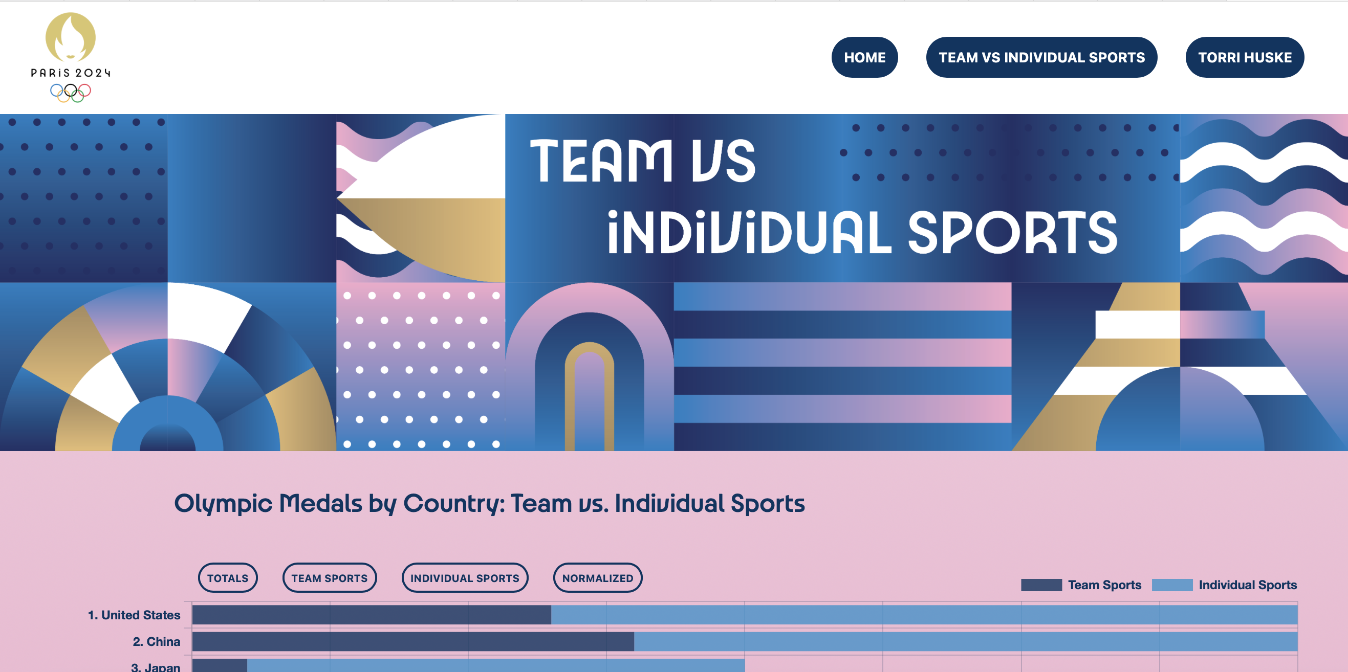
- Medal Trends Page: Dedicated to visualizing gold medal data, featuring bar graphs and an analysis section.
- Torri Huske Page: Focused on her Olympic journey, with:
- Two Sankey diagrams: Visually mapping her path to gold in both individual and team events.
- An analysis section: Highlighting key insights and takeaways from her performances.
Final Design
The finished website provides an engaging, intuitive exploration of the Olympic Games:
- Interactive Visualizations: The bar graphs and Sankey diagrams offer a dynamic way to explore trends and stories.
- Clear Structure: Dividing the content into distinct pages ensures a seamless and focused user experience.
- Analysis and Insights: Every section includes an analysis that distills key findings, making complex data easy to understand.
Through this project, I aimed to bridge the gap between data and storytelling, transforming numbers into narratives that celebrate athletic achievement and inspire exploration of the Olympic Games.