DELIVERABLES
- User Research
- User Testing
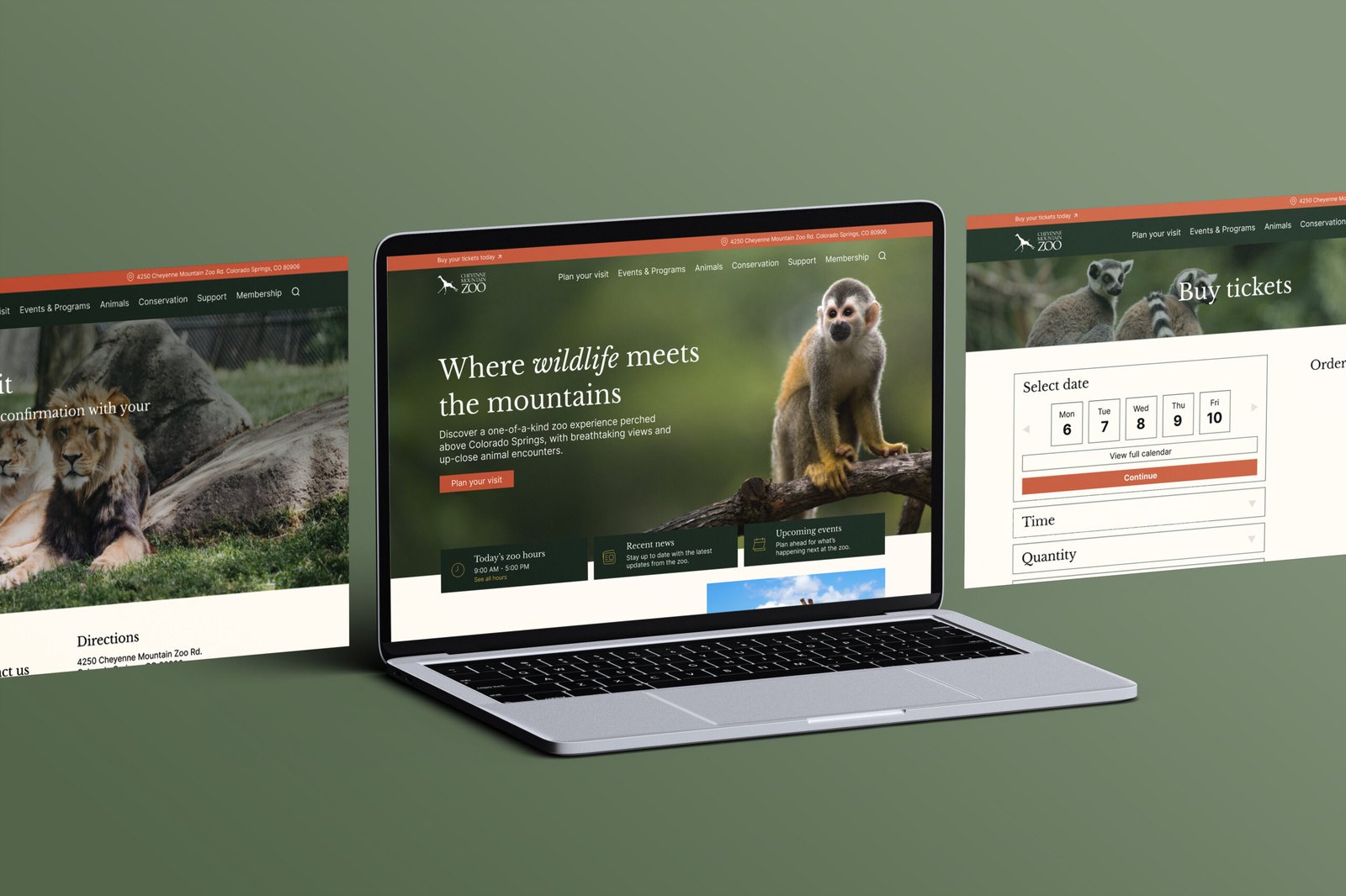
- High Fidelity Website
Redesign the ticket purchasing experience for the Cheyenne Mountain Zoo website, with a focus on improving usability and reducing friction throughout the process.
The existing ticketing experience is complex, inconsistent, and difficult to navigate. Users encountered unnecessary steps, outdated interface elements, and a lack of clarity when trying to complete a purchase.
User interviews were conducted to understand pain points in the current experience. The full ticketing flow was mapped to identify friction points across the journey.
Findings were synthesized using affinity mapping, revealing key patterns across users.
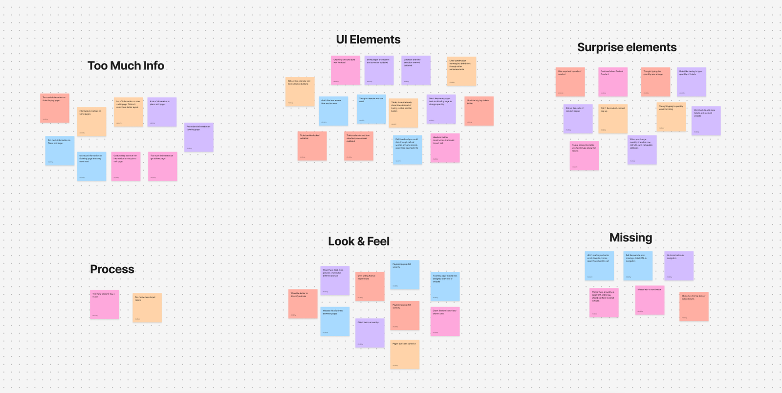
Pain Points
Pages are too text-heavy and overwhelming
Outdated UI elements (calendar, time selection, ticket adjustments)
Too many steps to complete a purchase
Visual inconsistency between the main site and ticketing flow
Insights from research informed “How Might We” questions to guide ideation and shape design decisions. The focus was on simplifying the flow, modernizing UI elements, and creating a more cohesive experience. A task flow for the ticket-buying process was also developed to identify friction points and streamline the user journey.

Adults purchasing tickets for the Cheyenne Mountain Zoo need a simpler and more intuitive ticket-buying process in order to complete purchases quickly and confidently without unnecessary steps or confusion.
Sketches explored a range of initial layout ideas, focusing on overall structure, content placement, and basic user flow. This stage emphasized quick exploration to test different directions and identify early opportunities for improvement.
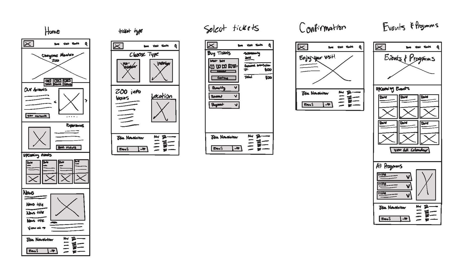
Wireframes refined concepts, establishing clearer hierarchy, structure, and navigation. Real content began to replace placeholders, allowing for a better understanding of how information would be organized and experienced.
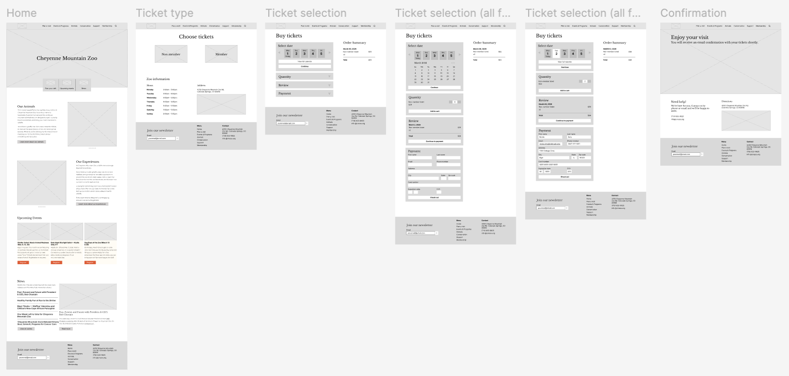
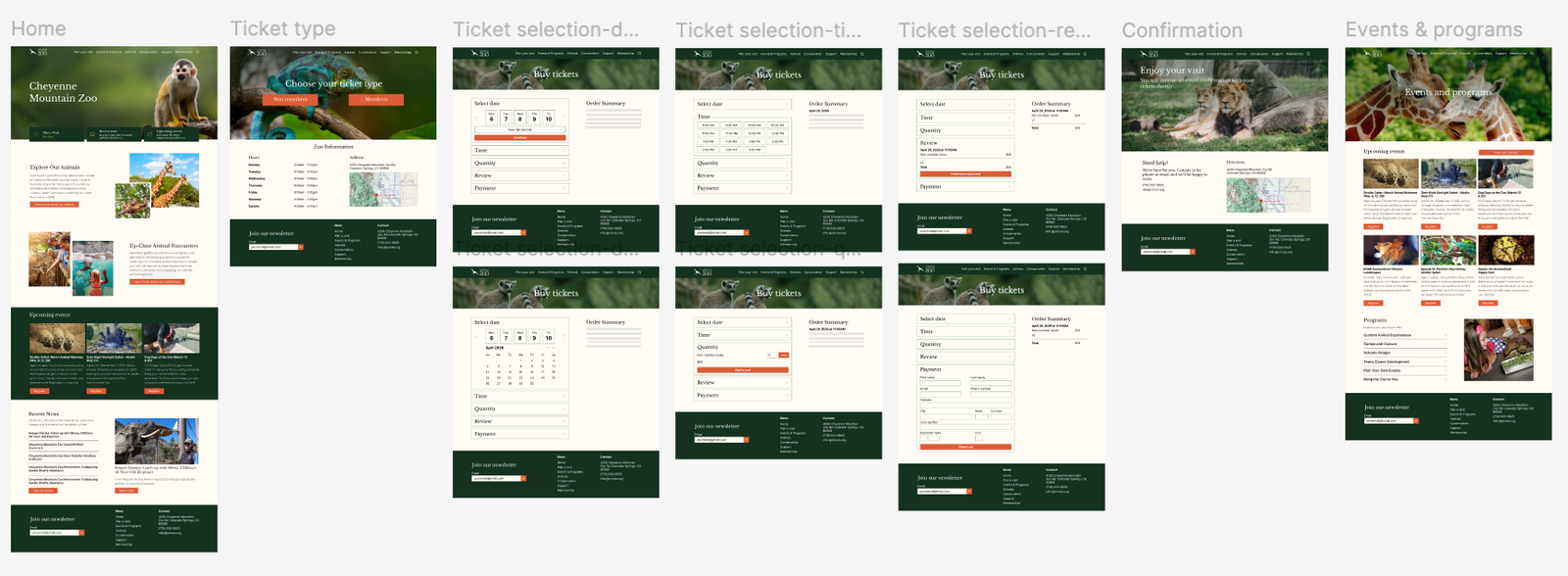
Content was fully defined and imagery was introduced to create a more engaging, cohesive experience aligned with the Cheyenne Mountain Zoo brand. UI elements were modernized and interactions refined, resulting in a polished prototype ready for testing.
The high-fidelity prototype was tested with users to evaluate usability and identify remaining gaps.
Future Plans
Next steps would be to expand the design into more pages and flows to create a more complete website experience. With more time, more focus would go into building out other parts of the site and making sure everything feels consistent throughout. There’s also room to add more detailed content, like clearer ticketing information and supporting details, to make the pages feel more complete and polished.
Conclusion
This project helped build a better understanding of both design fundamentals and the overall process. A lot was learned about things like spacing, sizing, and layout, along with the importance of research and task flows before starting design work. It also showed how much preparation goes into creating a strong final product and how that early work impacts the overall experience.
© 2026 nicdoty.com.